Showing posts with label Beautiful Home. Show all posts

Sunday, July 5, 2015

NEON in Home decor

While it's been quite a time I have posted something related to home. Now this post is all towards creating bright and cheerful moods in home which can be done incorporating splash of colors here and there. No, don't even think about big budget requiring projects. I am seriously not into them :-). 
While you all must have been heard about 'Neons'; Neon is the brightest shade of color which have been popular and quite a trend in outfits and accessories mostly the Fuchsia Pink, Bright Orange, Purple, Parrot and Lime Green colors. 

But have you ever thought how Neon color makes a room or any corner beam with brightness! The sparkly trend is quite a scene nowadays and in Spring and Summer ? Just go, get it done. How to make Neon color work in home decor? Stay with this post. Here are some ways to make the Neon color work in our home.  

# Have Plain and White walls ? Spruce the room up with Neon accessories.

The accessories can be simply done by changing the covers of the cushions, bed linens, painting, lights and/or rugs. Options are unlimited.


Splash of Neon via chair in a normal looking Entryway


# Balance is the key.

While making splash of some color, you don't need to overdo them, Just make sure you are not creating whole riot of colors in one place, keep as simple as sprucing up one corner at a time, or one area or only accessories at a time.

# While with Neon, Keep it simple. 

You need not have to add new furniture and accessories with whole lot of your money. As simple as a vase, light stand, a bright frame or a cushion can play to your Neon rhythm.

#Make the complementary colors work.  

Grey colors work wonder with Fuchsia pink, Limes and yellow. So does Green with white. So, while decorating with Neon, make most of those complementary colors. 


# If painting is your choice this summer, designate a wall, or a cabinet, or a whole kitchen to your choice of color. 


Hope you come up with some great idea to share with me. So, will you give some color to your home this year? Or this post doesn't help you in any way .....I will love to know. Have a great time ahead.

Friday, January 2, 2015

Pantone has announced the Color for 2015


Remember the Color of the year 2014 declared by Pantone last year? Radiant Orchid ! The results of Pantone's annual poll of esigners, retailers and manufacturers is out now, and 2015's Color of the Year is: Marsala, the wine color.


Every year since 1990, the Pantone Color Institute has announced its pick for the Color of the Year, which involves a surprisingly exhaustive selection process. While past picks have ranged from fuchsia-rose to emerald, it looks like 2015 is going to be filled with marsala, an earthy, reddish-brown hue.

 The color is more subdued than its aggressively pink predecessor, Marsala is a red that Pantone describes in the following ways:

"Enriches our mind, body and soul," "exuding confidence and stability." "Like a fortified wine," "tasteful," "the satisfying richness of a fulfilling meal," "grounding," "sophisticated, natural earthiness." "Hearty yet stylish," "burnished undertones," "versatile," "complex and full-bodied," "welcoming," "plush."

Comparing with last year's Radiant Orchid, Marsala is going to be a lot easier to wear on your face and person. No matter your skin tone, the sophisticated hue is an excellent choice for those looking to spice up their look. Add just a touch of color with a pair of shoes or turn heads in a vibrant coat. We also love how well Marsala plays with other colors. Look for items that are color-blocked with similar red-brown hues. In the winter, pair the color with jewel tones for an even bigger statement. Come spring, opt for marsala with icy pastels. It's also going to work well against rich fabrics.
Décor wise, the Marsala color is so rich which works along almost many earthy hues and even pastel colors. So, comprising the color in home décor has already been widely accepted.


The only thing I didn’t get is why did Pantone call the Wine color ‘Marsala’, not Oxblood or simply ‘Wine’ ? It seems like Pantone also like to make their own range of colors ! Anyway, acceptance of any color in our wardrobe, designs etc largely depends upon indivisual perception, and Marsala is already wearable one. Come on, you have got quite a hint for this New year’s gift shopping, haven’t you ?

Wishing you a hopeful New year ahead ….

Tuesday, December 31, 2013

Pantone Color of year 2014 : Royal Orchid

Pantone Color is back again! Pantone Inc.’s color of the year for 2014 is 'Radiant Orchid', succeeding 2013′s color Emerald. Royal Orchid has Pink hue in Purple accent. 

Executive Director of the Pantone Color Institute Leatrice Eiseman has made the color decision for the past 13 years. She said in a statement that the color of 2014 is “an invitation to innovation” that “encourages expanded creativity and originality.” She also claims it’s a color that Michelle Obama often wears and notes designers like Max Mara, Marc Jacobs, Salvatore Ferragamo, Ermengildo Zegnahave have been incorporating orchid hues into their collections in the past year.

Eiseman explains. "It's an invitation to innovation. The purple family offers (an) opportunity to do creative things."
Pantone officials have picked “radiant orchid” based on extensive interviews with industrial and fashion designers worldwide about what color they plan to use in upcoming seasons as well as sales of “color swatches,” according to the Wall Street .Journal
Like emerald, which was last year’s color of the year, this saturated hue is a rich jewel tone, but that doesn’t mean it’s only for fall and winter weddings. If you love bright colors then pair radiant orchid with teal or go simple and combine it with white for a fresh spring or summer palette!


Pantone sets color standards for commercial use by design industries. Pantone's pick for color of the year will certainly have a strong presence in fashion, beauty, home design and consumer products.


The color is very relevant for spring, but I think even going into next fall it can be very pretty. In ready-to-wear, Royal orchid color mixes beautifully with other tones like chocolate browns, and burgundy or Bordeaux makes for a deeper, richer tonal story.
As the experts predict, it will translate just as well into lip color and eye shadow, and in home furnishings. I would love it in velvet. It will certainly look so luxurious.


Experts believe all designers want everyone to have fun with their clothes and to enjoy what they are wearing, but there still needs to be a bit of practicality. Colors talk to the idea of optimism in fashion. The three most popular colors for spring 2014 are Dazzling Blue (the main blue shade featured on Facebook), Violet Tulip and Radiant Orchid. Rounding out the list, Celosia Orange, Freesia, Cayenne, Placid Blue, Paloma, Sand and Hemlock.

I think we will see purple furniture, pink poufs, fuchsia bedding frequently this year and perhaps Radiant Orchid gowns at this year's Oscars.
Jessica Pare in Royal Orchid colored Dress
So if there was ever a perfect time to buy orchids or sport the color, it is for this new year. personally I feel Royal Orchid is refreshing hue for home decor and interiors. Just paint a bland wall or dedicate a area rug for it, stairs or whatever space you have; Royal orchid is inviting and cosy. 
Image via : House Beautiful

By the way I wish all you readers and non readers a very happy new year 2014 ahead that will bring sense of prosperity and refreshing comparing to the past ones. Love, care, be happy.....and shine in your own inner light. :-)

Friday, September 27, 2013

How to make small space look larger (ideas :-)!!!

For most of all, space in our home is usually restricted. Unless you live in a house that is a Mansion and Villa, I think you too need to manage with whatever space you have. I prefer to use the areas in my home strategically than to live in a mansion that will make me spend more on cleaning and managing a larger space. Sometimes, we just need to give refreshing change or I would say facelift and makeover to whatever room and space we have. Here are some of popular and not so popular methods to make a room look larger than it really is!!


  1. Create a Focal point in the room :

Creating a focal point in a room is great as it makes our eyes stuck to the certain part or point of a room. 
Image : www.freshome.com
You can play with prints and patterns in a wall, or place only one furniture, chest or cupboard that is a statement in itself. 
Image : www.homedit.com
This will trick the eyes of the persons entering into the room and attention won't be on the tight space. 
Image : www.Inthralld.com
You can even place a soothing or eye catching artwork to fake a view or distract from architectural flaws.


  1. Give your window some Treatments:

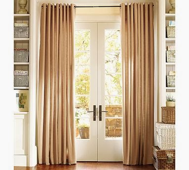
Hanging Curtains and rods in the window from the ceiling to the floor will make a room look larger. 
Image : www.Abodelove.blogspot.com

Image: www.potterybarn.com
Matching the color of curtain and drapes with wall color will only add to its enlargement. So keep matchy matchy in tight space.
For more precise look, please have a look on the image below by apartment therapy that i fell in love with. Always hang curatins wider in width even for small width windows in a tight space and from ceiling to floor to make the room appear larger.
Image: www.apartmenttherapy.com

  1. Choose Glass or Lucite Furnishing

It may seem costly to many but placing furniture, specially a table made of glass or Lucite will make the room larger as they will disappear when looked in a room with other things.

Can you notice the lucite dining table in the image below. You almost didn't notice it in a group right ?
Image: www.cococozy.com
These furnitures just disappears when looked with other things.
Image: www.nicheinteriors.com

  1. Give your walls some Stripes Treatment:

Giving walls and floors stripe treatment is budget friendly and will make a room feel larger. 
Image: www.betterdcoratingbible.com

Image : www.elledecor.com
Place a rug with stripe pattern, in a room or in staircase, this is a simple trick.


  1. Mirrors are always a hit

Everything made from glass in a room, it will make a room appear larger. Decorating with Mirrors make a room look spacious. 
Let Mirrors shine in almirahs or just let it be an art itself. This is one of the cheapest ways to maximize a small room, or just to feel it's been maximized.

  1. Choose items with functionality


Choose furnishings and decorative items that offer maximum functionality in minimal space. We should use two small round tables instead of one big coffee table which are easier to move around.

Thankx for the read and I hope this post selects some of the major changes with little efforts in a tight space that needs attention. We all need some ideas isn't it? :-)

Thursday, July 11, 2013

Home Decor with Mixed Prints


Our Home is our labor of love and It's entirely up to us how we give it a face through home decor. I am always partial towards prints and patterns as Prints in fabrics and objects in the house adds instant personality and can do all the talking without making a fuss. A plain room, some prints and patterns and Voila ! No need for expensive items and furniture. 

How mixed print are you ? i mean we all love prints in clothes, some big ones, some graphical.....and many more. But in home decor ?? I absolutely like the pattern play.

Mixed prints Cushion Covers

# While playing with pattern in room, this picture shows how color is coordinated while playing with different prints. Note the print and color of rug and cushion cover.
                                         

# While playing with pattern in home decor, Rug and carpets play crucial role. As they provide height and dimension to the room. 


# Need to make statement without breaking bank and want to look somber enough through furniture ? Printed covers are the best option, decor wise.


# Sometimes being in contrast is a win win. and think about a simple fabric or piece of cloth in prints to make a statement. Even in frames !!


# While playing with prints, always consider for height of a room or place to decor. And other prints to be mixed with. It should not be overwhelmed ! Instead, the prints should complement one another.


# Floral prints and geometric can complement each other.


# Simple tale of curtains and cushions in prints in like color.


Even the nature itself has created examples of Mixed prints !! So, why should we hesitate to spark them up in our home ?